Friday, August 13, 2010
questions about the course
Thursday, August 12, 2010
final post
Sunday, August 8, 2010
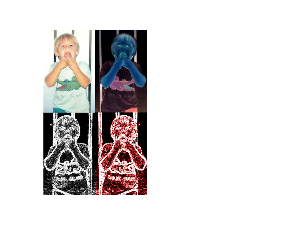
Self Portrait
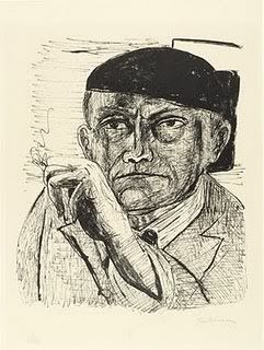
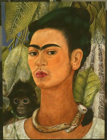
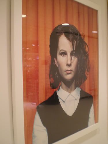
1. I chose the three portraits due to the fact that they seemed to resemble real life pictures. I was not a fan of the cartoon like portraits. I liked the black and white which inspired me to use apart of that in my self-portrait piece.
2. 2. I chose digital art, as my media since in my opinion have absolutely no artistic/drawing skill whatsoever. With digital, it allowed me to create a more unique piece.
3. 3. I was not sure which picture to choose while I was thinking of this project. I took a few pictures, however when I found the portrait of myself while I was younger; felt that no one else would choose a picture from years ago. I like doing things outside the box, and different than others.
4. 4. The piece represents my youth. Although I was young, I remember being in Florida as a kid.
5. 5. I used many colors to distort the original picture. The value of a few are also different along with emphasis to draw the viewer to the picture with a different look to each picture
6. 6. I did enjoy doing this picture. I was a little worried until I thought about creating my work by digital art due to the fact that I am quite bad with drawing.
7. 7. I like my final work very much. It is unique and believe others would enjoy it as well.
Friday, August 6, 2010
Peer Critique
Thursday, August 5, 2010
Week 10 Video Review
He believed that good art can come from anywhere. The results will settle everything from prejudice or preconception that someone may have. He also believes in fining the art down. The discussion is based on the place of values in judgements with modern criticism in art.
Greenberg on Pollock: An Interview by T. J. Clark
He believed that transitional paintings, the artist seemed to know that his paintings were transitional, not murals. He soon walked away from the traditional modern painting, and wanted to find his way to the edges to the paper rather than the edges being given, as they would on a stretched canvas
An Introduction to the Italian Renaissance (Giorgio Vasari)
Giotto "reinvented" the Roman style which soon began to influence many others. Masaccio was known for bringing drama in to the picture he was painting. da Vinci used what he knew with his art work, and was known for blending edges. The art based off the Renaissance was to reinforce the once believed concepts of perspective, balance, composition and realism.
The Critics: Stories from the Inside Pages
Critics are obviously very important with art, however a good critic will know the correct thing to say. The critics allow things to be said in order for others to speak out about the work. Good criticism gives the buyer a better "bang for your buck". Critics also allow artists to keep up on their skill, and may prevent from slacking. The critics may also give popularity to the artists work. The criticism is the media improves media art itself.
The Colonial Encounter: Views of Non-Western Art and Culture
France was initially misrepresented at the Worlds Fair. At the World's Fair, people were displayed next to animals in cages. Many images from Africa show violent behavior toward one another. The Dahome exhibit consisted of a group of thatched structures meaning there was no roads or highways and such.
Jackson Pollock: Michael Fried and T. J. Clark in Conversation
The amount of material that should be covered is argued among critics. Throughout the film Fried and Clark argue with one another. Fried believes Pollock focused on pictorial elements and was due to his move to abstract art.
I believe the first film, Greenberg on Art Criticism: An Interview by T. J. Clark may relate. The movie states "The experience is there and make you want to think"... With the firefighting theme I chose, the experience can be seen for myself along with others if they were involved in firefighting as well. The films were very in depth but seemed outdated. He seemed rather uninterested in what the interviewer was thinking and believed that since he was young, he did not know what was needed to understand about art. Was not a big fan of this segment, although I enjoyed seeing the mural pictures in the beginning of the film. The large "moveable" pictures were very nice.
Thursday, July 29, 2010
Blog Review
The Lowdown on Lowbrow
Lowbrow was an underground art movement in Los Angeles. It is a widespread movement includes the comic world, punk and hot rod street culture among others. The movie states that the artist has no taste, with naked women or hotrods. My exhibition will be no where near lowbrow. The only characteristic that may be the same are some bright colors that are used. My exhibition will be solely outside the box and include the "hell on earth" firefighting theme. It seems as if a lot of people were against the taste of the artist during this movement. Some of the pictures may be subject in the eyes of others.
Displaying Modern Art: The Tate Approach
The art was displayed in chronological order, showing each movement of art in which it was displayed. Some said that the art was too "loud" on the exhibit walls, and that viewers can have no knowledge of art and understand the piece. The critics wanted the art to be more than an entertainment figure. However, why make art where most of the audience cannot understand it? This will reduce the value in others eyes in my opinion. I saw some pieces that were abstract, and will not be the same as my art. Although, the thought that my pieces may be "busy" may apply to the fact that a lot will be going on in the pictures, not because it is clustered. A lot of critics about the Tate approach. Since my approach was outside the box, and was something that most would not think of, I do not believe there is a connection.
Bones of Contention: Native American Archaeology
Repatriation requires scientists first determine the bones tribal affiliation. Native Americans have ceremonies to discover whether the bones are their ancestors. I do not see a connection with the Native Americans/ tribal theme connection to my exhibition. This video stopped working halfway through and went completely blank. Upon many attempts in reloading it still did not work so I was unable to complete all parts of the video. However, if I did not choose to do my exhibition on the fire theme, I would be interested in doing it on this.
George Eastman House: Picture Perfect
The collection at Eastmans house represents 14,000 amateur and professional photographs. It contains 16,000 objects along with 5,000 cameras. He chose this to make art available to everyone who wanted to be exposed to art. Again this video did not work, a blank video page. I was able to see key points and did some research on my own in order to find out what the Eastman House was about.
Friday, July 23, 2010
video review
1. I chose Expressionism due to the fact that I believe the use of expressionism is very important is art. Without this a piece of art can be dull, and I wanted to learn more about the subject.2. Black White Red are used for sorrow, innocence and passion. It emphasized colors emotional properties.3. This movie relates to the book with Freeing Color: Fauvism and Expressionism in chapter 21. 4. I didn't realize how important colors relate to the feelings involved within the artwork. It was knowledgeable
1. I chose Matisse and Picasso due to the fact that it was most likely going to compare Picasso's work throughout his career along with others work. 2. The artist created a portrait of his wife, and the public was outraged. The only people who enjoyed the art was an American group who viewed the picture. 3. The book writes about Picasso in chapter 21, explaining his work along with the video. 4. I can't believe people did not like the picture of his wife. When I first saw the picture I actually enjoyed it.
1. No real reason for choosing Velazquez, the name sounded exciting. 2. Velazquez was famous for his equestrian paintings. He used the same painting of a boy in many artworks. 3. This relates to the book in my thoughts by modern to post modern artwork. 4. I did not like the video, as it was the least favorite of the 4. It was rather plain.
1. I chose dada and surrealism due the discussion posts and I wanted to learn more about this time of art. 2. This was a reaction towards WWI, German artist Kurt Schwitters work includes a very unique and appealing collage. The types of materials he used was anything he could get his hands on and didn't turn back. 3. This relates to the book in chapter 21, the topic on page 487 is World War I and after: Dada and Surrealism. 4. I enjoyed the collage by Schwitters best. The style and look was very unique. He said his art wanted to embrace everything in the world.
Sunday, July 18, 2010
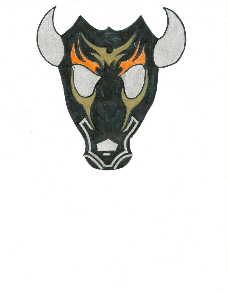
mask making
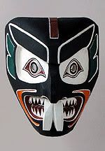
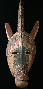
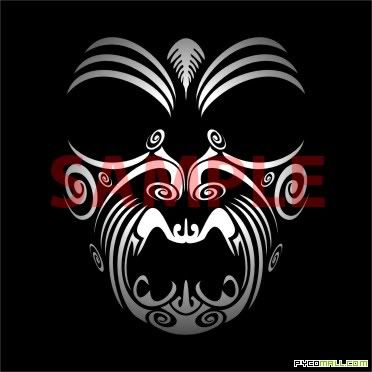
1. I chose the Native American Sea Man Mask, African Bobo Antelope and a picture I found on google that resembled african tribal art. I chose the Native American mask because I liked how the dark background looked with bright colors such as the orange. The African Bobo mask gave me the horned/chin idea on my mask I created. I also chose the picture of tribal art for the design on top of my mask. The lines and style of that gave me the inspiration needed for my mask.
2. The Native American mask shows a dark background allowing the bright colors to stand out on the mask. The red in the eyes along with the orange near the chin stand out. The African Bobo mask is more of an animal theme with a pointed chin, horn, and ears. The wood like color has greens along with reds. The tribal art is mainly pointed designs and different styles of lines that tie together.
3. Lines: continuos lines that give the mask style. Shape: an animal like theme with horns along with tribal lines. Color: a bright orange to catch the eyes, along with silver and gold with a black background.
4. I enjoyed creating this mask. It took me a long time in order to get an actual idea of what I actually wanted to create. It took some time due to the fact that my art work lacks, however was still entertaining.
Friday, July 16, 2010
Blog Review
1. I chose Chinese art because I didn't know much, if any about chinese art.
2. the hand on buddah open, suggests the absence of fear.
3. This movie related to chapter 19 with the art of East Asia, India, China and Japan
4. I thought the movie was rather boring at first, however the buddah statue was rather interesting.
1. I chose The Great Wave, due to the fact that it sounded rather interesting by the title and hopefully has to do with some sort of water art.
2. The 36 views of Mr Fuji includes all angles including all weather conditions.
3. This movie connects with Buddhism and its art, along with Japans art and culture.
4. Very interesting film, more entertaining and knowledge filled.
1. Hinduism seemed like an interesting type of film, I know nothing about.
2. Information regarding the stone shrines of Krishna Mandapam, it reflects the social life of those days.
3. This is related to page 428 with the start of hinduism and its art with the culture and social life.
4. The movie in my opinion could have been better. The Hindu eroticism with the carved panels was rather... interesting
1. I chose African art because of its traditional values.
2. Masks were named after "sinking feeling in the pit of your stomach", the black side of a mask refers to illness. spots equal small pocks
3. The masks arent as interesting in the book as they are in the video!
4. I like the videos rather than reading the text. It is much more entertaining, and I get more information out of them!
Sunday, July 11, 2010
1. Clyfford Still Abstract from 1937-1963
2. American Abstract art
1. Florescent projecting off the paintings.
2. White with black accents
3. Decorative borders made of wood along with wood floors
4. The room is quite open, allowing free flow of people
1. The art is along side each other in a line
2. They all represent abstract art throughout Still’s career
3. With the same theme being portrayed in his pictures, the colors used and style are somewhat different.
4. Some of the paintings have rather simple or boring looking frames while others have more appealing frames.
5. With the authors name, date, title, type of paint along with the information regarding the collection.
6. The art was very even throughout the display on the wall. Roughly two to three feet.
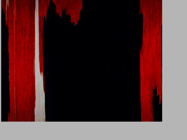
· Name: Clyfford Still
· Title: 1954
· Media: Oil on canvas
· Date: 1954
The good: This piece can tell a story of its own with simply the use of the form, color and lines. There is no landscape, nor portraits involved, just simply colors coming together. The colors come together to sort of look like a wood-like figure running down the canvas. A very bright white is used in the mix of the piece, which is an eye catcher. Reds, browns, white, and black are used to create this piece. I believe the artist did a very nice job with using the black as a background, it allows the white stripe to stand out more along with the browns and red to mix together. I am not very familiar with abstract art in terms of “what the artist is trying to say”, however seeing that the piece is titled 1954, this may have been an impact in the artists life at one time, or the experience he had during this time period.
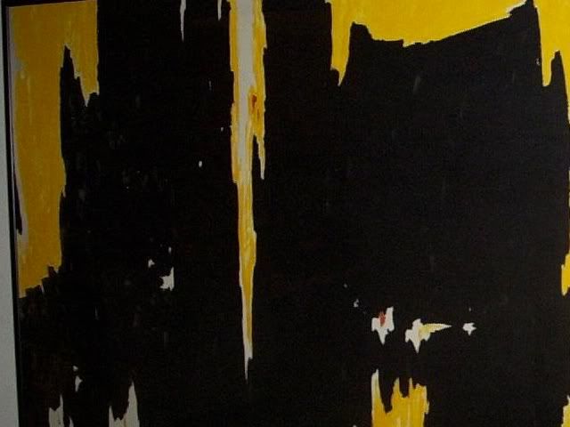
· Name: Clyfford Still
· Title: Number 1 D-1954
· Media: Oil on canvas
· Date: 1954
There is just something rather fascinating about abstract art in regards to other types of art. (ie: landscape/portrait). Anyone can have a different interpretation of the piece, which is why I find it much more exciting.
Again, the piece has a black background, allowing the other colors used to “jump” out at the viewer. Yellows, along with whites are used to create this piece running down the canvas. The structure of the piece with the different shapes so to speak of the colors running down the canvas is what caught my eye. If a nice bright eye catching yellow wasn’t used, perhaps I may have overlooked this piece.
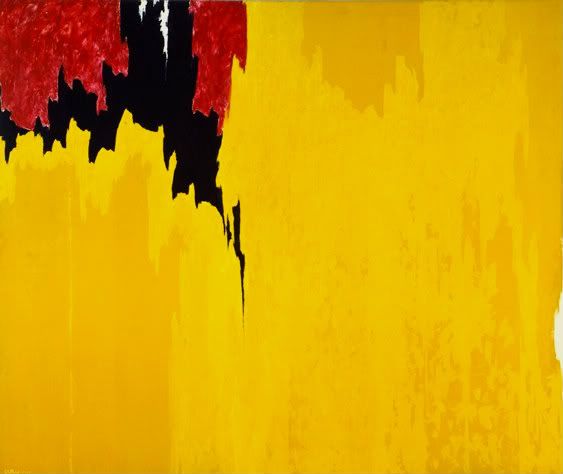
· Name: Clyfford Still
· Title: 1957
· Media: Oil on canvas
· Date: 1957
This is the final piece that I saved for last, perhaps the best in my view. It sort of is a combination of the two above, which I enjoyed, combining the yellows along with the reds, and blacks. This piece changes, as the background is now yellow, as to where the others were black, including a mysterious black and red shape to the top corner. The black running down the canvas has a very interesting look to it, along with the different shades of yellow used in the background.
Friday, July 9, 2010
Video Review
1. I first chose the late Gothic art video due to the fact that I have always found medieval art fascinating. I always thought of knights, wars along with monumental sculptures.
2. During the 16th century, buildings such as cathedrals are beginning to become grander than ever. The buildings also represented royalty with how they once lived and experienced.
3. It relates to chapter 15 along with the middle ages.
4. I enjoyed just watching the video seeing all the buildings you just don't see being created anymore. The history and art within the architecture is amazing.
1. I chose the drawings of Michelangelo due to the fact that I recognize him from the Sistine Chapel.
2. The unfinished 500 year old draft of the Sistine Chapel
3. This film relates to the book along with Western art.
4. Seeing the draft of the Sistine Chapel was unreal, the video had a connection with western art and the creation/transformation of Rome.
1. I had to choose da Vinci due to the Mona Lisa.
2. The close up of the Mona Lisa, the eyes I still cannot get over. No matter where you move the eyes seem to follow you!
3. Early art related with the Renaissance
4. When you think of Renaissance art, the Mona Lisa comes to mind. It was a cultural movement in the late middle ages spreading across Europe. As times changed the art did as well.
1. To be honest, the other titles didn't seem very exciting, so I chose the next exciting title which was The Night Watch.
2. The Night Watch painting became an object of pilgrimage for the Dutch. Along with the painting, people gather to experience a recreation of a picture masterpiece. People say you need to see it before you die. The picture has slashed with a knife, poured acid on it and also water.
3. I am not sure exactly sure how this relates other than it may be considered modern art?
4. I liked watching the video knowing these people recreate a paining and it means so much to them. Knowing the abuse the picture has taken is also amazing.
Saturday, June 26, 2010
Logo Design
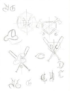
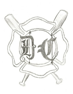
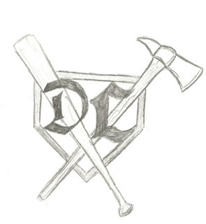
1. I thought creating the logo was very fun. It allowed me to combine the two things that I love, baseball and firefighting into my own unique symbol with my initials included.
2. I just thought of things I enjoyed doing, and thought of which items best would describe me within a logo.
3. I can actually draw! Although I used very simple symbols, ie: baseball bat, home plate, firefighter axe, helmet and maltese cross along with different types of lettering.
4. I found the website within the powerpoint was quite helpful, although I already knew the approach in which I wanted to go prior to looking at the website, it helped with basic logo information. It was a good starter to what can be simple included within a logo.
Reviewing Peer Responses
Sunday, June 20, 2010
Art Gallery Visit
My trip to the art gallery was a complete disaster to say the least. In an attempt to get into the Albright Knox three different times on Friday, I finally succeeded on lucky number three. On the website the hours say on friday: noon-10 pm. I went at 3pm however a concert was being held and it would have cost $45 just to get in! I was told to come back when the gallery was open from 5-9. I soon came back around 5 and again was not able to get in. I walked around back to talk to a worker in the back entrance hoping to get in, however my second attempt failed. I was told to go back to the front and say I was there for the art museum, however this did not "fool" concert security. My third attempt I came back at 8, when the museum CLOSED! I was told the museum would be open until 9, however due to the concert only 8pm. I was able to do a quit search of some pieces of work, however most I looked up online. Not many of the workers spoke fluent english, and may have been confused with what was going on exactly.
The following artworks I felt a connection with:
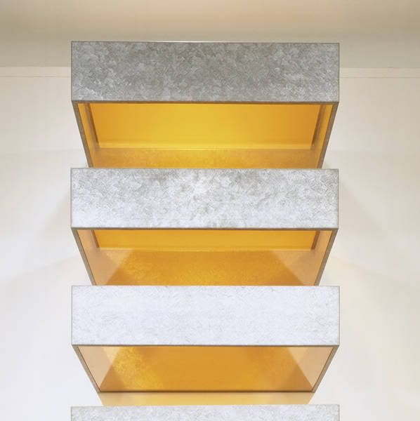
1. I felt a connection with this sculpture due to the fact that it seems so simple however the colors and simplicity of the sculpture is what was interesting to me. I especially enjoyed the textured look on the base of the iron.
Artist: Donald Judd
Title: Untitled
Media: galvanized iron and plexiglass
Date: 1969
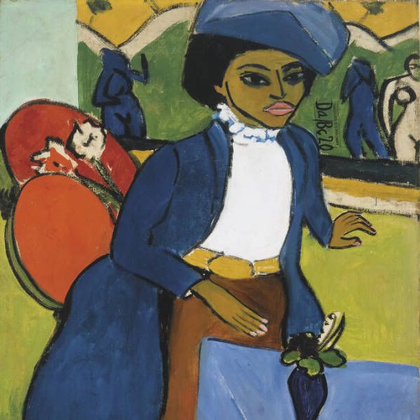
2. I am more into sculptures rather than paintings, however this piece i felt a connection with. The colors used and the date of when it was created is what was most exciting to me.
Artist: Ernst Ludwig Kirchner
Title: Portrait of a Woman
Media: oil on canvas
Date: 1911
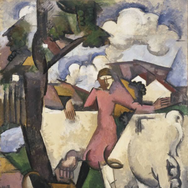
3. I felt a connection with this piece because I think it has a more "home" feeling to it. With the clouds, trees and what seems to be a house in the background reminded me of being happy at home.
Artist: Roger de La Fresnaye
Title: Marie Ressort
Media: oil on canvas
Date: 1913
The following artworks made an impact or impession on me:
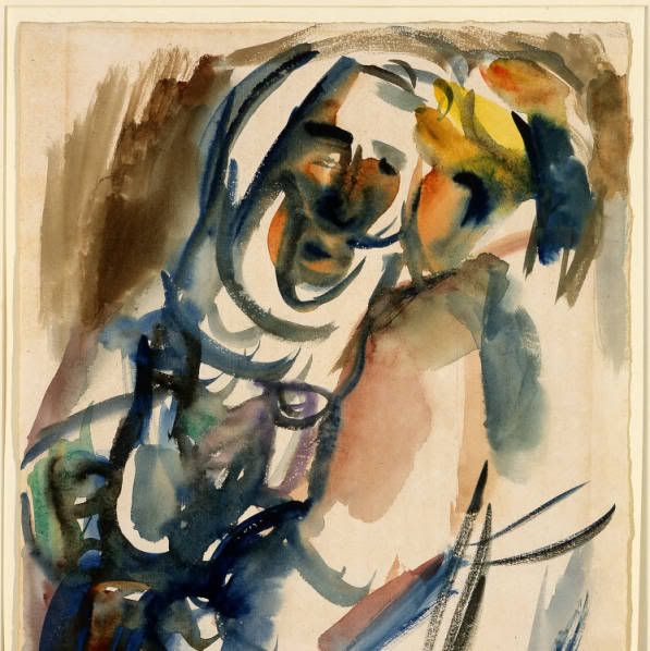
1. This piece made an impression on me due to the fact that we just created a small watercolor piece. It seems so simple while looking at it, but the amount of time and skill it must have taken in order to create this is what impressed me. I sure know if I attempted a watercolor piece such as this, it would turn out terrible!
Artist: Ben Shahn
Title: Arabs
Media: watercolor
Date: 1969
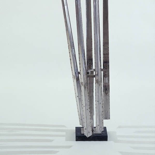
2. I do not know what drew me to this picture other than the fact that it reminded me of one movie I used to watch, Edward Scissorhands. It may seem silly, however it is what drew me to the sculpture.
Artist: George Rickey
Title: Five Lines
Media: stainless steel
Date: 1964
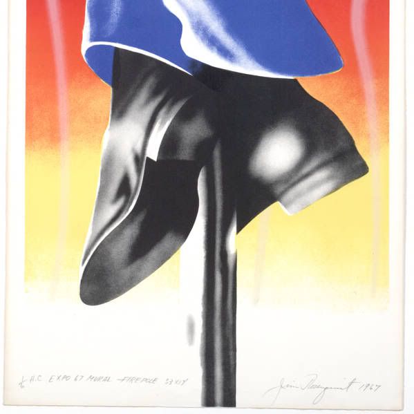
3. This piece perhaps made the biggest impact on me. I am a firefighter and as it should obviously reminds me of being one.
Artist: James Rosenquist
Title: Expo 67- Firepole
Media: lithograph
Date: 1967
The following artworks I would like to know more about:
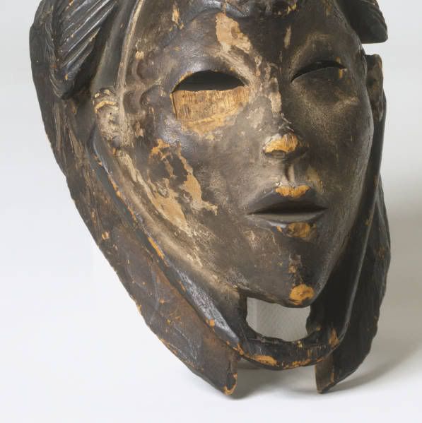
1. This piece seems very interesting, and may have a lot of history behind the meaning of what it means. I would like to know what exactly it means as it can tell a rather interesting story. I enjoy pieces from years ago rather than modern art.
Artist: African
Title: Mask of a Young Woman
Media: wood
Date: 1933
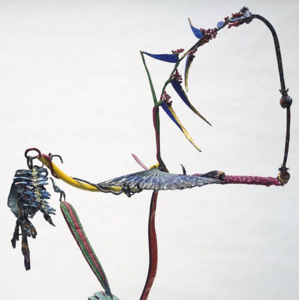
2. This piece just looks incredible. The colors used and the shape makes it catch your eye. I would like to know what the artist was thinking while creating this, and the meaning of what she intended on.
Artist: Nancy Graves
Title: Dellaleve
Media: bronze with polychrome patina and enamel
Date: 1984
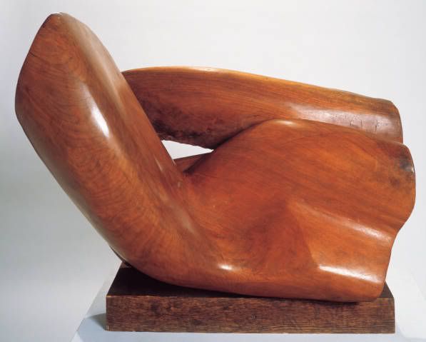
3. I am not exactly sure what is going on with this piece. I would like to know more about it just due to I have no idea what it is.
Artist: Raoul Hague
Title: Mount Marion Walnut
Media: walnut
Date 1954
