Saturday, June 26, 2010

Logo Design


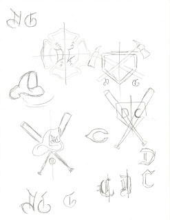
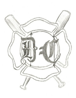
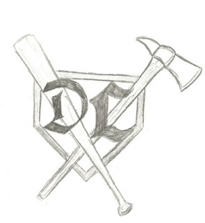
1. I thought creating the logo was very fun. It allowed me to combine the two things that I love, baseball and firefighting into my own unique symbol with my initials included.

2. I just thought of things I enjoyed doing, and thought of which items best would describe me within a logo.

3. I can actually draw! Although I used very simple symbols, ie: baseball bat, home plate, firefighter axe, helmet and maltese cross along with different types of lettering.

4. I found the website within the powerpoint was quite helpful, although I already knew the approach in which I wanted to go prior to looking at the website, it helped with basic logo information. It was a good starter to what can be simple included within a logo.

Reviewing Peer Responses

In the two blogs I looked at, no images were the same as the ones I picked. I enjoyed the theatre box picture with the picture showing the audience instead of the actual play itself. I like to see what other students picked in regards to the paintings and other forms of art in which I selected. Perhaps ones I overlooked at the time. I found the comments were helpful and enjoyed seeing what they thought of the pictures I used.

I had trouble finding the hyperlink on my mac, so I included the direct links:

http://bojasc72.blogspot.com/2010/06/albright-knox-art-gallery-visit-project.html?showComment=1277614381876_AIe9_BHtN-ps0BQsQ6cQe-Z-VTOm9FN4brzdCIVODhcCZLifZEDQOoIxYe_ZCZ0bwy3nFTcsTCOsXfC3mOfa-9UuqUpBG8T0FheyZoxGSf3xrpr9k_0Nce2_LO1r4qaktue0RkxVRJcTZoZLhCdtqpUTHVgdh02aWNaktl81aaapaG2wVVfpRAfuCymSJ2Zo2ptZY1NsMTEcPEK8RVwtG2Vs7TpNcyFCqvqPamxEqvcOQCggLr6lx2f-ACGB-DlR_inbKGb6XwpR#c5022955021766682102

http://mejajs35.blogspot.com/2010/06/art-museum-visit-albright-knox.html?showComment=1277614086001_AIe9_BGF33l5WdWRM58QCknECQUnqA9-qbD_uFpgb1Wvkm8nehuZ9jwVSH4E_R7axxQf2Nr58KVZkYszg1W50XPKiokGFsV3IBZLMOLMduDJd7O3HAFTigvh8StkVBC67CkGDQJU5lxcI50DZGis7GIped8xwoy1xgtsOro9BdroFrtU5uV6vbzNsbHeAtP3pgNla6cYmw6RVDEkZGWY3HBl3dkqvonCeOX_9UEWuRje2apgHE7F_mc#c5070565590970324965

Sunday, June 20, 2010

Art Gallery Visit

My trip to the art gallery was a complete disaster to say the least. In an attempt to get into the Albright Knox three different times on Friday, I finally succeeded on lucky number three. On the website the hours say on friday: noon-10 pm. I went at 3pm however a concert was being held and it would have cost $45 just to get in! I was told to come back when the gallery was open from 5-9. I soon came back around 5 and again was not able to get in. I walked around back to talk to a worker in the back entrance hoping to get in, however my second attempt failed. I was told to go back to the front and say I was there for the art museum, however this did not "fool" concert security. My third attempt I came back at 8, when the museum CLOSED! I was told the museum would be open until 9, however due to the concert only 8pm. I was able to do a quit search of some pieces of work, however most I looked up online. Not many of the workers spoke fluent english, and may have been confused with what was going on exactly.


The following artworks I felt a connection with:

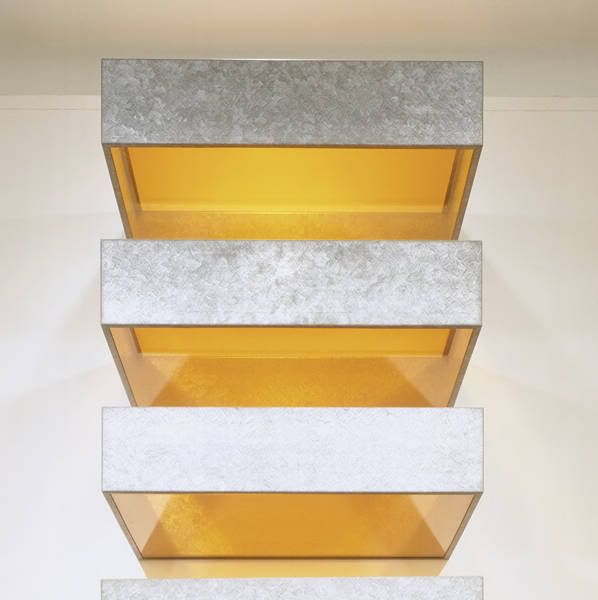
1. I felt a connection with this sculpture due to the fact that it seems so simple however the colors and simplicity of the sculpture is what was interesting to me. I especially enjoyed the textured look on the base of the iron.

Artist: Donald Judd

Title: Untitled

Media: galvanized iron and plexiglass

Date: 1969
Photobucket


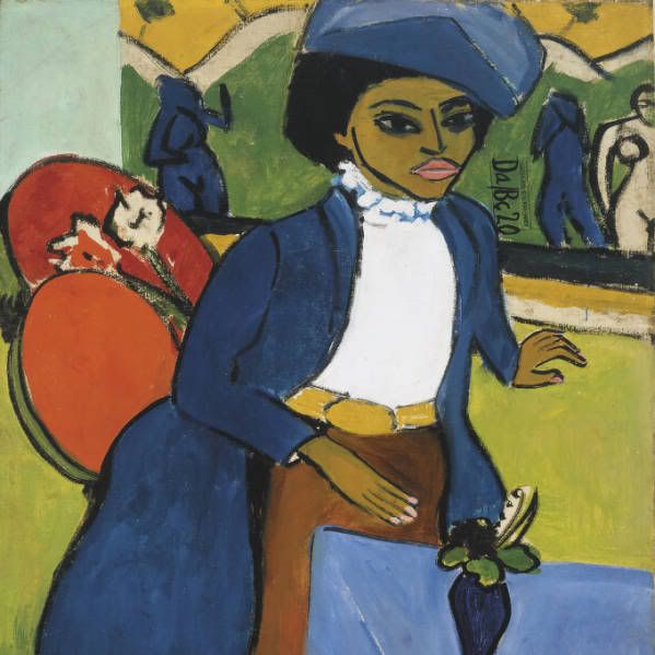
2. I am more into sculptures rather than paintings, however this piece i felt a connection with. The colors used and the date of when it was created is what was most exciting to me.

Artist: Ernst Ludwig Kirchner

Title: Portrait of a Woman

Media: oil on canvas

Date: 1911
Photobucket


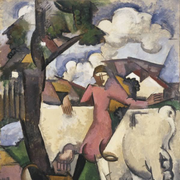
3. I felt a connection with this piece because I think it has a more "home" feeling to it. With the clouds, trees and what seems to be a house in the background reminded me of being happy at home.

Artist: Roger de La Fresnaye

Title: Marie Ressort

Media: oil on canvas

Date: 1913
Photobucket


The following artworks made an impact or impession on me:

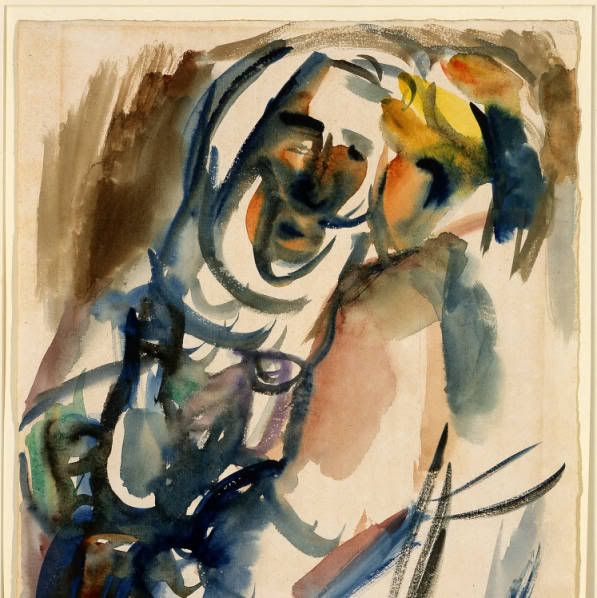
1. This piece made an impression on me due to the fact that we just created a small watercolor piece. It seems so simple while looking at it, but the amount of time and skill it must have taken in order to create this is what impressed me. I sure know if I attempted a watercolor piece such as this, it would turn out terrible!

Artist: Ben Shahn

Title: Arabs

Media: watercolor

Date: 1969
Photobucket


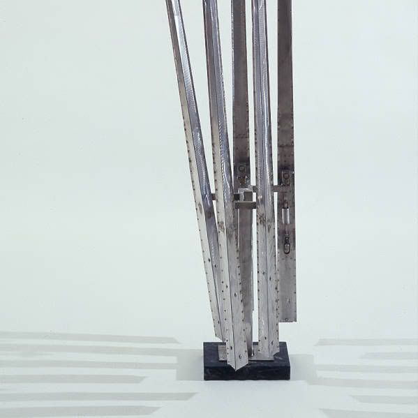
2. I do not know what drew me to this picture other than the fact that it reminded me of one movie I used to watch, Edward Scissorhands. It may seem silly, however it is what drew me to the sculpture.

Artist: George Rickey

Title: Five Lines

Media: stainless steel

Date: 1964
Photobucket


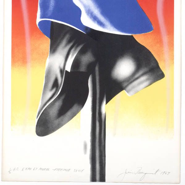
3. This piece perhaps made the biggest impact on me. I am a firefighter and as it should obviously reminds me of being one.

Artist: James Rosenquist

Title: Expo 67- Firepole

Media: lithograph

Date: 1967
Photobucket


The following artworks I would like to know more about:

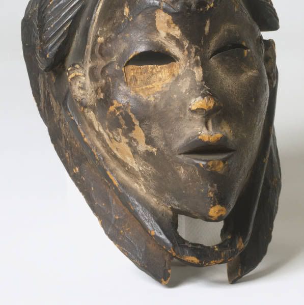
1. This piece seems very interesting, and may have a lot of history behind the meaning of what it means. I would like to know what exactly it means as it can tell a rather interesting story. I enjoy pieces from years ago rather than modern art.

Artist: African

Title: Mask of a Young Woman

Media: wood

Date: 1933
Photobucket


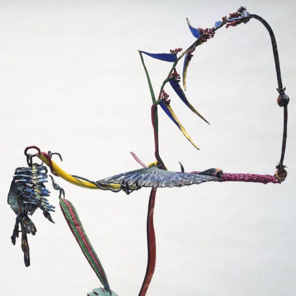
2. This piece just looks incredible. The colors used and the shape makes it catch your eye. I would like to know what the artist was thinking while creating this, and the meaning of what she intended on.

Artist: Nancy Graves

Title: Dellaleve

Media: bronze with polychrome patina and enamel

Date: 1984
Photobucket


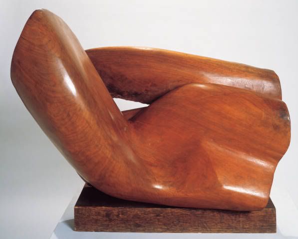
3. I am not exactly sure what is going on with this piece. I would like to know more about it just due to I have no idea what it is.

Artist: Raoul Hague

Title: Mount Marion Walnut

Media: walnut

Date 1954
Photobucket

Friday, June 18, 2010

Art Material Exploration

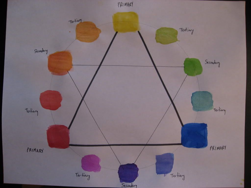
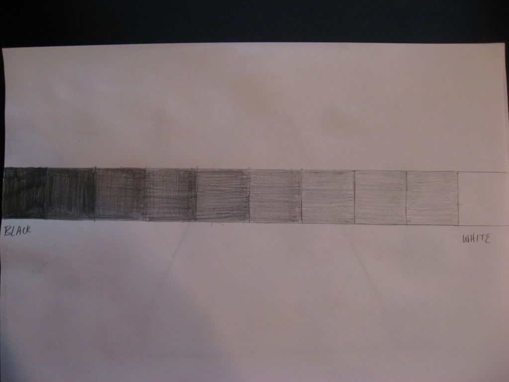
1. While creating both the value scale along with the color wheel, my thoughts were I felt like I was young again painting on paper. I haven't done this in years and it was very interesting to me. When I was little I never knew the importance of mixing different colors in order to create secondary and tertiary colors.

2. I enjoyed the color wheel far more than the value scale. The value scale was fun for the most part but involved much more tedious work. The color wheel was much more interesting and kept my interest level.

3. How to create secondary and tertiary colors with the mixing of the three primary colors. Without the primary colors you cannot create the other two color schemes.

4. I mostly enjoyed towards the end of the watercolor video, where the artist uses the "4 ways to mix color". The part I liked was the mixing of two colors but still being able to see both colors in the same box, sort of a "tie-dye" look to it. The techniques of glazzing and wet-in-wet. Although we did not use this technique today, I hope we do in the future. The videos were helpful especially with the color wheel.

Color Wheel: Photobucket

Value Scale: Photobucket

Monday, June 14, 2010

My Reflection

After completing this project, I never realized the beauty instilled with objects around my neighborhood. Upon learning the different elements and principles, and applying them to certain objects, my first art project was created. I have never created a photo album with a website before, but it was relatively easy in doing so. The pictures I took were objects around my house and neighborhood. Overall the project was rather interesting and would much rather prefer a hands-on project rather than doing a written report as most classes require.

Friday, June 11, 2010

Color Theory and Emotional Effects

1. Color is used in other ways than just art. How often do you hear of the expression "I'm feeling blue."? They are fairly common and a good illustration in how color is related to our emotions. The emotions can correspond to the colors red, green and blue.

2. The amount of beauty color can withhold is what intrigues me the most, seeing bright colors that represent the the object. The right color is what makes the object beautiful.

3. The amount of feelings involved with the color used in a painting. You can tell how important it is to her with the amount of color being used, how difficult it is for her to accept her work in the right view of how she wants viewers to see her work. Possibly to the average person they would not notice just how important it is.

4. The meaning of art feeling is the modern world. Also I never noticed the importance of the Mona Lisa. It was created to display not of a marilyn monroe like icon, but human, nor a religious icon. It is the greatest spectacle of all time, and most famous painting with genuine individuality.

Sunday, June 6, 2010

my first blog

1. The process was fairly simple. Although I have never had a blog, I am very familiar with gmail accounts.

2. I expect to learn a general knowledge with understanding and examining art work throughout history.

3. I actually prefer online courses rather than sitting in a classroom. I feel you can communicate with the professor a lot easier knowing they are on angel waiting for our work. It is nice not having to drive to campus and sit in a classroom for a few hours